Starting from scratch
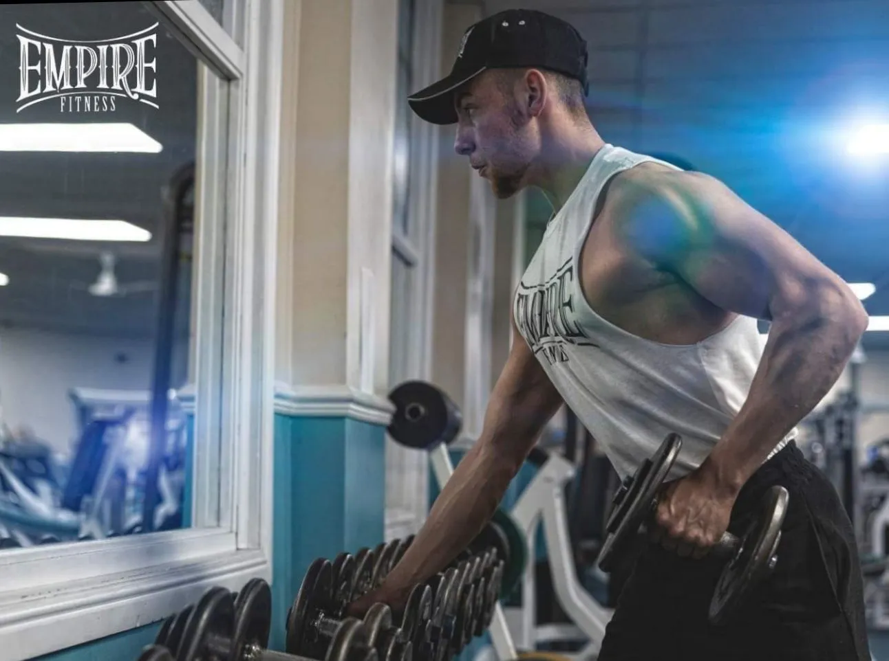
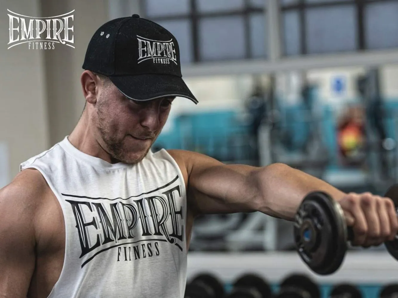
James had the coaching experience and real gym photography. He needed the brand, the words and a website that made the offer easy to understand.
The audience included people who felt uncertain about gyms. That ruled out the usual hard-sell fitness language. The identity still needed strength, but the experience had to feel welcoming from the first line.
Confidence without the hard sell
The identity uses condensed type and direct language to feel capable. Navy and blue give it weight, while teal marks progress and keeps the tone open rather than aggressive.


Approachable personal training with a plan built around you.
One page with one clear job
Most visitors will arrive after James has shared the link or someone has recommended him. The page meets that existing interest with the information people need: who James helps, how the coaching works, what it costs and how to start.
Built lean on purpose
Astro produces a fast static page with almost no browser JavaScript. There is no CMS, booking engine or added machinery because this site does not need one.
- Responsive layouts
- Semantic HTML
- Visible keyboard focus
- Reduced-motion support
- Local business structured data
- Minimal browser JavaScript
The attention to detail and customer service was second to none. Lancio Studio delivered a professional and personal approach that I am incredibly pleased with.
Two parts of the same launch
The identity and the website were built together, so the brand and the words say the same thing in the same voice.
Need similar work?
Tell us what needs to change and what a better result looks like. We will reply within one working day.